The Cosmonaut Stylus

Cosmonaut Stylus

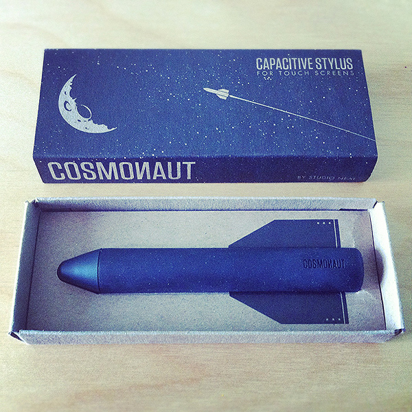
On the recommendation of Marco Arment (he's usually spot-on when it comes to product reviews), I've decided to give Studio Neat's Cosmonaut Stylus a try. It arrived this morning in a beautiful little box.

I've played around with it on my phone and, yeah, it's pretty good. It's well made, it's heavy (in a good way) and it works. I was on the lookout for a stylus for drawing with when I re-enter the world of tablets and I can already tell that this one'll work great on an iPad. On a phone, it's maybe a little chunky (if you're going for detail it definitely obscures exactly where you're drawing, but nowhere near how badly your finger does). Also, slightly more pressure than I'd expect is needed to register a tap - possibly because I'm being fairly ginger with it on the smaller screen. These are nitpicks though, on the whole the Cosmonaut is really nice to use and I'm looking forward to trying out some 'proper' drawings soon.

Draw Something

I'm not a massive fan of app-of-the-moment Draw Something. It's has loads of problems and if, like me, you've played a whole lotta iSketch over the years, it's kinda boring in comparison. Playing Draw Something using the Cosmonaut does improve things, however, and I'm gonna stick it out in the hope that the forthcoming update, at the very least, adds a frickin' undo button.

If you'd like a game, my username is davidgalletly.

I'm Selling an iPad 2

First off, let me apologise about the un-classy self-serving sales post. I will keep this short.

Like most of the world, I'm selling an iPad 2. It's a black, 32gb, wi-fi model in really good condition. It's the first ever thing I've sold on Ebay - hence this post. There you can see more photos and information. I even made a horrendous video of myself to accompany the auction to prove, as someone with no feedback, that I'm a real person.

If this is of interest, you can find it here. As a wee incentive / apology for clogging up your RSS with what is essentially a big advert - should someone buy this gizmo who reads my site, let me know and I'll chuck in a free print or something.

The auction ends tonight (Monday) at around 10pm and it can be picked up in Glasgow tomorrow if that's helpful.

Sorry x

Withered Hand: Heart Heart EP

Of all the things I work on, I think the stuff I get to do for the Scottish music label Fence Records is my favourite. I've been a fan forever and this latest project has allowed me to be involved in something that I remember wishing I could do back in college.

Back then, Fence would release really cool little EPs on CD-R as a kind of record-club called Picket Fence. I had tons of these things. The artists had complete freedom and, because it was quite a small-scale set up, you'd get loads of odd music and weirdness that you couldn't find on 'proper' albums. Each PF release came in a neat wee cardboard sleeve with artwork by the act themselves and, if I remember correctly, a spray painted issue number. *

I loved that stuff. I remember showing them to my classmates saying how cool it would be to work on something like that.

Well, recently Johnny and Kenny asked me if I'd be interested in working on the artwork to a kind of spiritual-successor to the Picket Fences. Of course I bloomin' would! Didn't they know I'd said to my classmates how cool it would be to work on something like that 10 years ago?

So, as of last month, I'm happy to announce the launch of Chart-Ruse. The initial set in the F3NC3 R⅓CORDS’ 33s subscription-based EP series. **

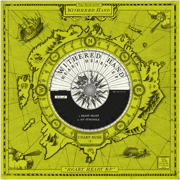
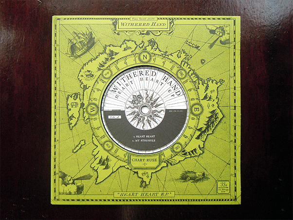
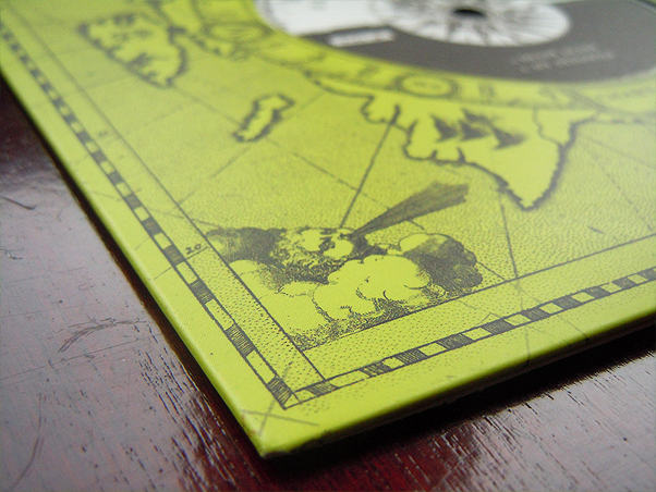
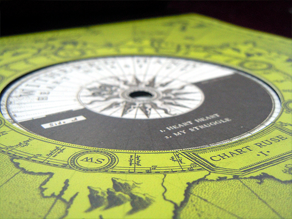
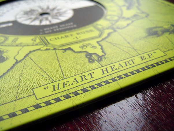
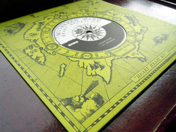
Kicking things off, is Heart Heart EP by Edinburgh's mighty Withered Hand. The 7'' vinyl features 3 tracks plus a King Creosote remix which is exclusive to the record itself (as in, you can't even download it like you can the others). The title track is particularly fantastic and can be enjoyed here:

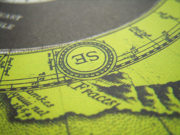
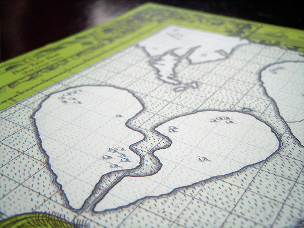
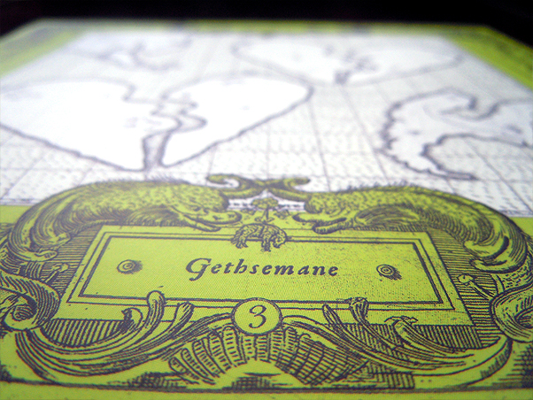
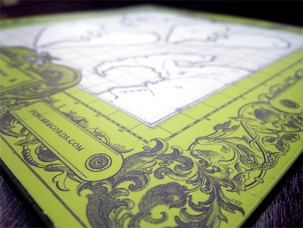
For the artwork, I gathered together dozens of ancient maps, charts and diagrams and set to work with my (digital) scissors and glue to collage together a bright green (chartreuse - get it?) fantasy-world of mountains and sea monsters. The reverse (which can be seen properly here) features a broken-heart design that I adapted from Withered Hand himself.

The end result is something I'm really happy with. I tried to keep it loose and fun and, well, Fencey, while at the same time giving the series its own particular look and feel.

Moving on from here, the artwork for the next two Chart-Ruse EPs (by Delifinger and a still-secret third artist) will feature different islands and additions to part 1. Following that, we'll change the colour, change the title and change the artwork for the next 3. And so on, and so on. Confusing? Yeah, kinda, but that's the fun of it. As time goes on, it'll start to make sense.

The Chart-Ruse subscriptions have sold out but you can buy Withered Hand's Heart Heart EP and pre-order Delifinger's Escapes EP individually. Keep an eye out for news on the third release, and subsequent sets in the series, by following Fence or myself on Twitter. The full artwork is on my site and there are more photos on my Flickr.

* The spraypaint would make the CD stick inside the sleeve in the most maddening way. It somehow added to the charm, however.

** Fence, as you may have noticed, LOVE a convoluted title and a bad pun. KC's doing, I think.

What I Wore Today: Skateboarding

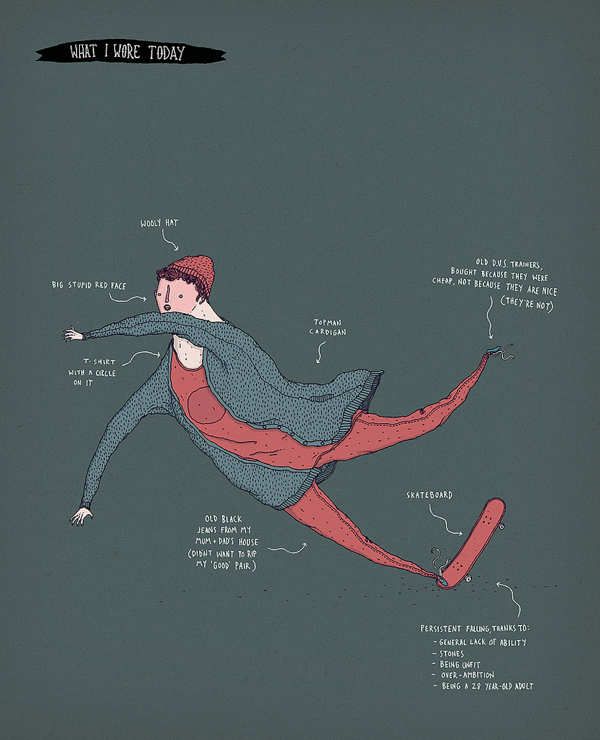
What I Wore Today If you don't know, What I Wore Today (drawings only) is a Flickr group started by Gemma Correll that encourages people to regularly draw self-portraits wearing, well, whatever you're wearing. It results in a nice mixture of both drawing and fashion styles.

My outfit choices are worryingly repetitive so I usually try to add a wee activity in there too. This drawing is from a few days ago on a visit to my parent's house - it was the first time it had been dry enough to go to the skatepark in 6 months. I grabbed my board and nipped round for a wheech about. I was a wobbly old man. My legs are still sore.

Also, I've recently started a What I Wore Today section on my site where I'll try to archive all of these daft things.

Squarespace: The Final Frontier

Squarespace computer

This post began life as a short conversation about blogging platforms had back in December on Twitter between Carolyn Alexander, HelloJenuine and myself. I abandoned it due to time issues and, funnily enough, dissatisfaction with my as-it-stood blog. What follows may be of no interest to anyone beyond the three of us. Actually, it may be of no interest to Carolyn and Jen. I'm not even sure that I'm interested.

Carolyn, like myself (and Jen a little before us) had made the switch from Blogger to Tumblr and had found frustrations in the transition. It's clear that there is no perfect solution for what we, and many others, are trying to do with these different platforms. What do you do if you're too picky about certain things to be happy with a mass-market service, but not picky enough about everything to build it yourself?

No idea, but this is how I got to where I am today:

BLOGGER

When I first started a blog, Blogger seemed like the obvious choice. Easy to set-up, easy to customise, easy to post. It was owned by Google and, back in 2006, Google were pretty great. For a couple of years I went so far as to use my Blogger blog as my main site through a hacky system of treating posts like they were pages. I even filled one up with thumbnails and used it as a portfolio.

But after 5 years and a few hundred posts, Blogger felt done. It seemed unloved and out-of-date and I was uncomfortable having my work there. I wanted out. I became reluctant to post. Google, with their increasing tendency to mess with or axe their products, finally pushed me away. (1.)

WORDPRESS

Where to go, though? Wordpress.org? Too much choice! Too heavy. Too many moving parts. I knew I didn't want to fanny about with setting up hosting and installing a CMS and learning how everything works, so it'd need to be the Wordpress.com web-based thing then? I guess, but I couldn't even tell how expensive what I needed would be. Everything's a premium bolt-on. Want to use your own domain? Sure… so $12.00/yr. Want to customise how it looks? Yeah… so $30.00/yr. Wan't to go ad-free? Um, probably… $29.97/yr. Extra space? Know what? forget it.

Ach, maybe I didn't investigate properly. I'd have figured it out. I didn't (and don't) have the energy.

TUMBLR

Tumblr, then. Tumblr seemed ok. Lots of people I knew were using Tumblr. It was popular, which probably meant it was being taken care of. I like Marco. He makes good stuff. He made Tumblr. He probably made it pretty good. Tumblr was a place for cool kids. I'm a cool kid. Lord knows I love animated gifs. Maybe I'd post a photo from the 90s of a model smoking a cigarette.

I signed up, bashed together a layout real quick, pointed a subdomain at it and was done. I had a new blog! It was free, it looked pretty and I could update it from my phone. I could finally stop procrastinating and start post(crastinat)ing!

Then… nothing really. I wrote a few bits & pieces, posted a few pictures and, y'know, just didn't feel it.

It's an odd one, Tumblr. It quickly became obvious that it was designed to do certain things and it worked best when doing those things and not-so-well when doing anything else. Funny that. Tumblr's built for microblogging. It's for sharing things you find. It's for dipping in-and-out of. Even though you can make a real bloggy-blog there, when you do it feels like you're not doing it right.

The little things killed it for me. The way Tumblr handles pictures, for example, is infuriating. Uploading an image to your own blog requires making it a 'photo post', which wouldn't be a problem if 'photo posts' didn't allow you to add a title. I like titles! Ok, fine, make it a 'text post' then. Now you can add a title, but you'll need to host your image somewhere else. 'sake. I ended up making a blog images set on Flickr, which worked alright for posting my own work, but heaven forbid I wanted to post someone else's. Do I link it directly? What if they take it down? Put it on my Flickr? Doesn't seem right. Tinypic? Yuck.

The community side of Tumblr is weird too. As a producer-of-things, it's nice to see your work shared & liked & shared & liked. What do they call it, reblogged? Tumbl'd? It's positive feedback, but it feels kinda temporary. Everything goes through that damn blue dashboard and gets lost in the stream. Posting artwork there feels akin to putting a joke on Twitter and enjoying how it can whizz around if someone retweets it. Nice, but temporary. The lack of comments too, while not a deal breaker for me (I mostly agree with the 'no comments' side of the debate), just add to the feeling that you're trying to play snooker on a pool table. (2.)

I still use Tumblr. I really like it for other stuff.

This, I think, is where Jen & Carolyn were / are and what got us tweeting in frustration. It's a problem for a certain kind of blogger. Artists, illustrators, photographers and graphic designers all know how they'd like their own stuff to look and to work more than your average person. Ideally they'd design and maintain it themselves. Most importantly they want to enjoy using the stupid thing once it's up and running. What many, myself included, don't particularly want to do is to learn a ton of web development or focus too much energy dealing with daft hacky nonsense that gets in the way. We're neither casual-users, nor power-users. Smart-casual-users, maybe.

SQUARESPACE

Merlin Mann, via his amazing Back to Work podcast, turned me on to Squarespace and that's where I am now. Admittedly he was selling a product, but damn, he sold it well: Easy to use! Simple when you need it! Powerful when you need it! Reliable! Flexible! Sustainable! Well maintained! Fun!

Those things, on the whole, have rung true. I used the free trial, put a blog together and noodled around. After a few days, I decided it was worth the money and moved my Tumblr content over. A few weeks later I moved my full davidgalletly.com site over there and, as of today, I'm not in bad shape. For the first time since my early days on Blogspot I have everything in one place and can add new stuff without a headache.

Without sounding like an advertising pitch - if you're not happy with your current set-up, maybe give Squarespace a look. They're not for everyone and they're not perfect - the UI takes getting used to and some stuff doesn't work quite how I'd expect - but regardless, they provide a good service and they fit my needs better than most.

Stay tuned for a TON of new work and a TON of new posts. I had to get this big, boring one outta my system to kick it off.

(1.) The same wariness of Google has resulted in my recent move away from Feedburner too. I've tried to make sure as many subscribers as possible have survived the shift but if you want to be sure, the definitive location of my RSS feed is: davidgalletly.com/blog/rss.xml. (back to position)

(2.) This is a bad analogy, but I like bad analogies. (back to position)

Petition to Rebuild Stirling Skatepark

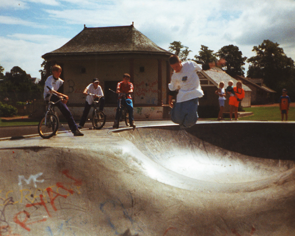
The Bowls, King's Park Stirling 1996Me at Stirling Skatepark circa 95/96 during a misguided rollerblading phase.

SHORT VERSION: to secure important funding, a short-timescale (before Fri 10th February!) petition has been set for the rebuild of Stirling Skatepark. If anyone who thinks this would be a good idea could show their support, I'd really appreciate it. You can sign the petition here.

Despite moving to Glasgow over a year ago, I still get through to Stirling as often as I can. When I'm back, I'm catching up with my parents, Alex's parents or friends (or all of the above). While that doesn't usually leave too much spare time, I do try to head along to the wee skatepark if I can.

Stirling Skatepark aka 'The Bowls', situated in King's Park, is a small, rough concrete affair that has seen better days. It's badly designed and not much fun to use. I love it, though. It was my park growing up and, as far as I'm concerned, it's still my park. From 1994 through 2009, I'd say that I visited that little grey island almost every (dry) day. Some summers 12hr+ sessions were the norm. And, even though my usage has shrunk to a handful of visits a year, I reckon there's a good chance that I've spent more time in that skatepark than anyone else in the whole wide world.

My mum and dad live nearby, you see. I could get there in 5-10 mins and nip home on a whim if I needed to. If the skatepark was a pub, I was a local. Whenever I go back, I half expect to be greeted by bunch of friends but instead it's a new bunch of young folk who make me feel like the old, crap skateboarder that I am. And that's fine. That's the way it should be.

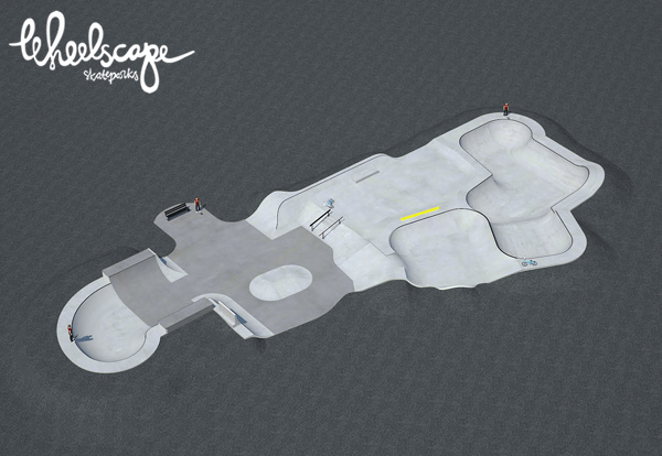
Proposed design by Wheelscape.

Anyway, the reason I'm bringing this up is that there are plans afoot to renovate the park. For the past few years, BMXer, park regular and all-around good dude Ali Hair has lead a campaign to secure funding, planning and permission to, y'know, make the place less crappy. He's close too. Really close. There are plans, there is permission and there is almost funding. A last-minute hitch, however, has required a petition to allay any doubt that the park might not be popular enough to justify the expense. That's totally understandable. To a lot of people a skatepark is nothing more than an intimidating eyesore. It's a place where youngsters 'hang out' and do things. Recently, the park has been in such disrepair that it's actually kinda dangerous to use and if there has been any lessening in attendance, I'd blame the design and upkeep of the facilities before worrying that kids don't enjoy having fun anymore. That or the weather.

Regardless, here's something I've noticed in nearly 20 years of using Stirling Skatepark: If it's dry, if it's daylight and if it's not ridiculously early in the morning, there will always be someone using that park. And it's not even a very good park!

When the weather's good, you're all but guaranteed that it'll be busy too. That's all the justification needed. How many other free-to-use public facilities can you say that about? That wee park has kept hundreds, if not thousands of young (and not so young) people entertained, out of trouble and well-exercised for a long, long time. Skateparks are great little social melting-pots. They let kids meet people from other schools, from other towns, from other backgrounds, cultures and occupations. Without Stirling Skatepark, I'd have left school a sheltered, anti-social, uncultured little geek (or at least more of a sheltered, anti-social, uncultured little geek). The park has always been safe, quiet and friendly. Yeah, teenagers hang about there and pull up their hoods but guess what? That's what teenagers do. They do that everywhere. They can't get enough of doing that. Skateparks don't encourage troublemakers and if you think they do, I'm sorry, you're wrong. Kids go to these places because they love riding skateboards, bikes and rollerblades.

So, although I'd be sad to see the old place go, a better skatepark is desperately needed in Stirling. It's a small place; there's not much to do. People get bored. If the city wants to keep up with the rest of the country, we need to be on top of stuff like this. Falkirk has a great park, for God's sake. Falkirk! Skateboarding and BMX have been popular for long enough that there's no excuse for any town not to support them properly.

If you agree, please sign the rebuild Stirling Skatepark petition before Friday the 10th of January 2012. Thanks.

For more information, the best place to go is the Stirling Skatepark Users Facebook page where Ali keeps everyone up to date by announcing the latest developments. Being Facebook, you can also catch up / discover / skate-date with loads of the people who actually use the park. In addition, there is a Stirling Skateboard Users blog that covers key points in the process. The proposed design is by the nice guys at Wheelscape Skatepark Construction.

Thoughts on iBooks, iAuthor & The Illustration Racket

After watching the iBooks Textbooks launch and having a little (like, 2 seconds) noodle around with Apple's new iBooks Author app, my thoughts turned immediately, inevitably, to my own gig - the illustration racket. I think this might be a Big Deal.

To talk from the top of my (admittedly uninformed) head for a minute - if there is now a way, however restricted it may be, to self-publish to the iBookstore, that's gotta be a Big Deal, doesn't it? As a starting point it has to be. Writers, obviously, should be freaking out, but what about illustrators? What about designers or DIY zine makers, knitting enthusiasts or poets? Can we now in theory distribute our books, our portfolios, our zines, our patterns and comics to millions of people? Jesus, if that's the case then yeah, it's definitely a Big Deal.

Depending on how flexible the tools turn out to be (looks like an ISBN may be required) and how expensive (I think you're charged to be listed on the iBook / App store), this could be really interesting. Imagine a digital, animated zine available to anyone with an iPhone or iPad for a couple of quid. Imagine an english student and an illustration student collaborating on a book and making a fortune. Imagine someone like Swatpaz making an interactive adventure story for kids and charging nothing for it because he's a nice guy. Best of all, imagine every illustrator (or agent) given an elegant way to distribute portfolios to anyone who might be interested. That'd be bananas.

Aye, there's a dark side too. The image of a classroom with kids all in rows, pecking away at their iPads (their expensive, fragile, wouldn't-take-it-to-school iPads) is, y'know, creepy. Things'd surely descend into fart apps and cyber-bullying madness by second period. And exactly how much sway should a big technology company have in education anyway? I'm not smart enough to know.

Every step we take away from pens & paper is a step we won't take back. We all love print. We all love glue and photocopies and posting our little envelopes. I don't think anyone wants to see that stuff go away. But, even if books do decline, even if it's better to do most things digitally, there'll still be a place for paper, just like there's still a place for vinyl. Don't worry about that, concentrate on the new stuff!

So what to do? I dunno. I should probably do a little more research and play with the apps properly. That'd be a start. This post is a thinking-as-I-go kinda deal and I'm likely way off with a lot of this - do Apple really want every Tom, Dick or Harry hucking rubbish all over the place? Seems kinda messy. Maybe by launching these products Apple will motivate someone else to do something similar. Regardless, I can't wait to hear what the guys on 5by5 have to say about the whole thing. John Gruber's take is already interesting. Will I make a book? Hmm, I'd certainly like to. Does that mean I will? Um…

Right now all eyes are on education, but it'll just take one clever sod with one clever idea to open the door for everyone. And y'know what? Whoever does that'll probably get a Big (book) Deal out of it.

EDIT: I have just noticed that I refer to the iBooks Author app as 'iAuthor' in the title of this post. Despite this being incorrect I will let it fly because I kinda like it.

Tiptoeing Boots

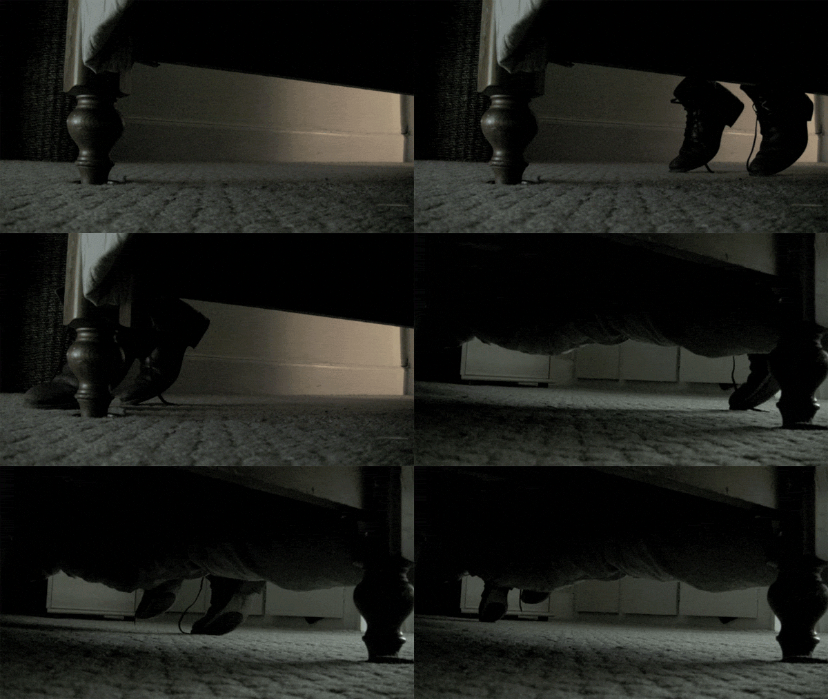
While making You Only Went Out To Get Drunk Last Night for Kid Canaveral, Alex came up with an idea for what ended up being my favourite scene in the video. She suggested that our 'character' might tip-toe through the bedroom, drunkenly attempting not to wake his partner. This was perfect. It added a gag to what was pretty much a filler sequence. After a few sums, it looked likely that I'd be able to time the shots with the quietest part of the song which gave a really nice build-up to the finale.

Executing the idea proved fiddly. It was 2am and we had very little equipment to speak of. Our bedroom, while not tiny, is also pretty tight for floorspace. These limitations took most of the directing decisions out of my hands - we had to go under the bed. We had to animate the boots from above, pinching the cuffs with our fingernails.

Up until this point, our roles had been set. I'd animate the objects and Alex would work the camera. This scene was different. We swapped back and forth a number of times trying to get something, anything, to work. The problem was two fold: animating the boots was uncomfortable (really uncomfortable. lying-with-your-weight-on-the-edge-of-a-wooden-footboard uncomfortable) meaning we'd only get a few minutes before the 'mover' had to abandon their post and start over; also, you were working blind with no way to tell if your hand was in shot, if you'd moved too far or if what you were doing would achieve the desired effect.

We got there, though. I turned out to be the better animator / endurer of pain and Alex was the better filmer / communicator of how things looked. There was a lot of 'Dave, I can still see your fingers on that left boot' going on. The end result, while not exactly beautiful, is pretty much exactly what I tried to achieve. A success in particular because neither of us knew what the hell we were doing.

On a related note, Kid Canaveral are nominated to support Graham Coxon. You can help their chances by heading to the page and liking their video entry under the Edinburgh Liquid Rooms dropdown. Good idea that.

EDIT: a direct link to the vote page for the KC video is here. God you're a lazy bugger.

Instagramming

For the past year I've been using Instagram, the photo filtering / sharing app. I really like it. I know, I know - making digial pictures look all retro and analogue is cheesy. But, guess what? It's kinda fun. You can be pretty subtle and at least they don't force you to use the faux-Polaroid borders anymore.

Anyway, 'til now, the only person I followed or (allowed to follow myself) was Alex. We had a private photostream (nothing saucy, honest) that only the other could see. It was a pretty cool thing - if Alex was away somewhere, I'd occasionally get a text saying 'check instagram' and I'd know to take a look at whatever she'd found on her travels.

The other day though, disaster struck. Alex accidentally made her stream public and was followed by some people she knew. What do we do?! A first-world problem. Should she block her new friends and go back to how things were before? Maybe. Should she keep her stream public? Maybe. If she did that though, should I keep my stream private? Could I remain monogamous with a polygamist?. I'd feel like a chump. The resolution was to both 'go public' on Instagram and set up a new, private account to keep our silly little world of daft faces and in-jokes alive.

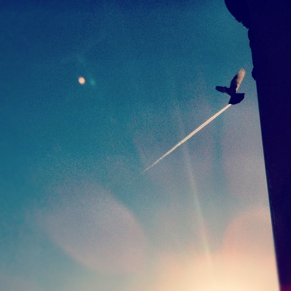
So, should you want to, you can now follow me on Instagram. Just add me as davidgalletly.

My photos range from interesting-ish (like the photo above) to very, very dull. I guess that's true of most people. Maybe with audience of 2+, I'll put a little more effort in. Maybe I'll freak out and delete everyone. Welcome to the future David, it looks like 1978.

Gilbert Crockett: Switch Flip Up Stairs

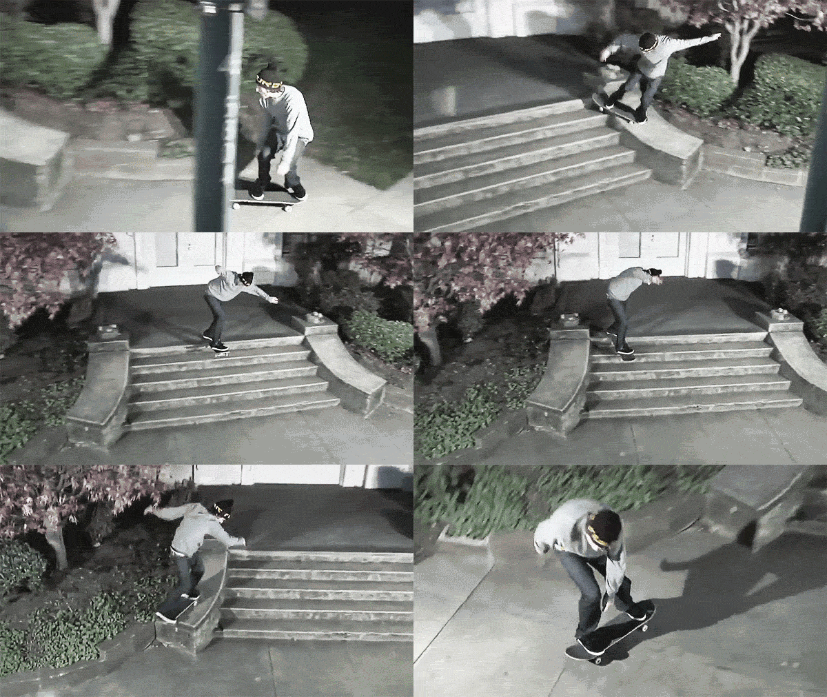
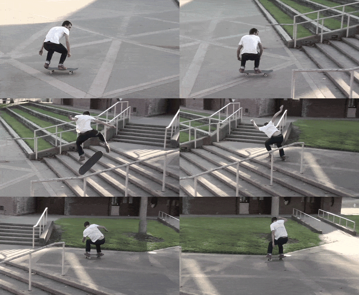
I've been following Thrasher's King of The Road, a sort of skateboarding version of Challenge Anneka, where skate teams go cross-country and try to score points by completing a list of challenges (grind a certain rail / do a trick naked / kiss an old lady etc.). You kinda forget how daft it is because it's been running for years but it always delivers some good footage.

After watching the most recent episode, I made this animated gif of Gilbert Crockett's amazing switch kickflip up 6 (longish!) stairs. Partly because it's a pretty frickin' good trick and partly to see if I could work out how to turn a YouTube clip into an animation. Turns out I could!

Back to Blog

For the past couple of days I've been playing with my website. I've now finished (for the time being). My blog is now successfully powered by the fantastic Squarespace. I figured that, after a good few years of using free services (Blogger and more recently Tumblr), I needed something a little more substantial. I can now properly manage my content and... comments are back!

To any visitors, I guess not much has changed. That's a good thing. I've spent an afternoon moving posts over to my new space and setting up a bunch of 301s to make sure all links point where they should. I'm no expert but, hopefully, the transition was pretty seamless.

For subscribers, you might have been bombarded with a bunch of old content today. I apologise if that was the case. The worst of it is now over. My understanding of RSS etc. is pretty limited, but I've tried to make sure I lost as few people as possible in the switch. Should you be an existing subscriber, or a new visitor wishing to subscribe, my Feedburner feed is the one to use. That'll make sure you stay with me wherever I go.

I've a post in the works about my reasons for switching that, once I've finished off a little work, should appear soon. In the meantime, here's to another year of posting rubbish.

A 2011 Montage: 12 Photos Per Month

2011 Montage

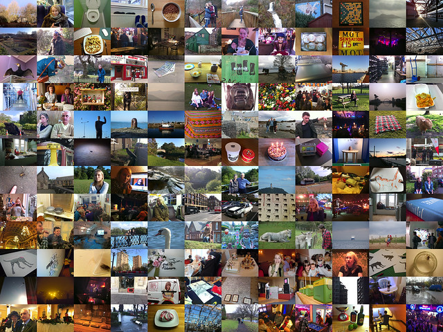
For the 4th time now I’ve taken enough photographs to put together a montage covering the 12 months since the last New Year. Arranged chronologically, each row of the above image represents a month of 2011 using photos taken with my camera or my phone*. The previous ones are here: 2008, 2009, 2010.

This has become a tradition. I sit down, usually on New Years Day, and take a few hours sorting through iPhoto, dropping pictures into folders and sticking them together in Photoshop. The end result, while likely dull to anyone but myself and maybe a few of my friends is, to me, quite a special little thing. That 4400 x 3300 (full size) rectangle contains the 28th year of my life. I can’t change that. Not now, not ever.

For some months, the pickings were mighty thin. Maybe I didn’t do much, maybe I didn’t carry a camera. For others, there were so many photos that I had to be completely ruthless with my editing. It’s a hard balance weighing up how much I like a particular image with how much it represents a time or an event. I also try to include a good mixture of ‘important things’ (eg. a holiday / an exhibition) and ‘silly things’ (goofing off around the house / stuff we’ve eaten).

On the whole, 2011 has been a funny one. Small in some ways - I didn’t leave Scotland, I didn’t exhibit much, I put on a little weight. Big in others - I worked on some of my most important jobs (many of which I can’t talk about yet), I spent my first full year living with Alex and we passed the ‘6 months until our wedding’ milestone. I saw less of my friends and less of my parents than at any other time of my life. I made some ‘career’ decisions that I really regret and others that I’m really proud of. At some points I was very happy, at others I was very sad.

Mostly when I look back, one thought comes to mind: I wish I’d had more time. More time to draw. More time hanging out with Alex. More time alone. More time doing nothing. More time with friends and family. More time working for people I like, less time working for people I hate.

I may do a few more end of year / start of year posts over the next few days, I may not. I know they’re not that interesting to read, but they can be fun to write. Please stay tuned for more rubbish from me throughout 2012. I think it’s gonna be crazy. Thanks for reading my blog. I love you x

* owning a new, fancy phone has presented a problem this year - square photographs! Thanks to the likes of Instagram and Hipstamatic, I’ve actually taken more square pictures than rectangular ones. This has meant that, to keep things consistent, many of my best photos didn’t make the cut. I’m considering making a second, 12 x 12 square montage to fix this.