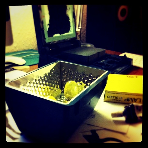
 This evening I spent a little time putting together a Gocco screenprint for an upcoming project with Jonnie Common. I can't show too much the now but I think it'll be a nice wee thing. Gocco printing, and I guess screenprinting in general, turns you into a little one-man production line. It's completely satisfying - probably because there's no denying that you're being productive. You literally produce stuff. Rows and rows of prints appear before you where once there was nothing. It's great. If Gocco consumables weren't so damn hard to come by I'd make one of these things every week. A UK supplier would get so much business it's scary. Keep your potatoes skinned here or on JC's site for more info in the next week or so (obvious hint: it's a combined music & artwork package). For an early heads up, you can either follow Jonnie or follow me on Twitter.
An Animated Photo

After seeing Jamie Beck's pretty cool animated photographs (basically carefully planned animated gifs) a few weeks back, I wondered if I'd be able to recreate the effect myself. Armed with a tripod, a video camera, iMovie and Photoshop, I discovered that I could.
The above image, while not groundbreaking, represents a fun wee hour of problem solving that I'm really happy with. It turned out pretty good, eh? Now that I understand the process a bit, there's a few ideas I'd like to try out that could work out great. When I find the time to go on a wee photo hunt, I'll post them up here. Isolating animation in a clip like that is a really peculiar effect. I guess we've HD video to thank for making these things possible - when a still frame can pass for a photograph, you can do a bunch of cool stuff.
These 'animated photographs' are kind of interesting. They elevate the humble gif - an old, mainly forgotten, format, with its 256 colours and grainy feel, to something new. Sure, there have always been a ton of gifs generated from funny video clips, but pre-planned and considered gif photoshoots? That's a little different. I've a feeling that Beck might've started a wee trend here - we might be seeing these things in site mastheads and accompanying 'virtual' magazine articles before long. That is if the lengthy post-production editing isn't too off-putting.
Also, I mainly like my photo because it captures Alex drinking tea, playing on the computer and listening to music on a great wee day-off we had. She thinks it's creepy, but I dunno, I think there's something nice about it. Like one of those magic Harry Potter photos made real.
Stoppit & Tidyup Character Design
Stoppit and Tidyup is a cartoon I remember fondly from my childhood. Created by Charles Mills and Terry Brain, the guys behind one of my all time favourites - Trapdoor, S&T was a short-lived series that followed the lives of the weird and wonderful inhabitants of Do As You're Told. It ran in 1988 for 13 episodes on the BBC.
I didn't love Stoppit and Tidyup the way I loved Trapdoor or Portland Bill or Mysterious Cities of Gold, but it definitely had something that kept it with me. The introduction used to fire up my imagination - the weird music, the Terry Wogan narration and, most of all, the seemingly endless (to a 5 year old) parade of fascinating characters just made me want to grab a pencil and paper and draw some monsters.
The characters, that was it. I couldn't get over how cool they looked. At that age, I knew a little about how animation worked and understood that they were drawings that someone had sat down and thought up. How could someone draw something so good? They were perfect to a little kid like me. Clean Your Teeth's teeth were so white. Hurry Up was so fast. As for I Said No, well, he was just the biggest thing in the whole wide world. I loved him the most - the way he completely filled the screen and looked so utterly pissed off all the time. You can check out all the characters in the intro to this episode:
As an adult, rediscovering the show through a YouTube nostalgia trip (best thing about an Apple TV btw - can't beat watching Raggy Dolls on the big telly), I've got a new appreciation of the brilliantly inventive character design in Stoppit & Tidyup. So many great monster ideas. The stressed-out Take Care is great - forever flapping his tiny wings to stay in the air, the aforementioned Clean Your Teeth too - all swaggering by like he's the man.
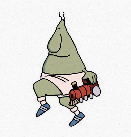
The best, though (and by best I mean creepiest), is Go And Play, who I've posted above. My new favourite. A silent man-child of a thing dressed in tiny white shorts (pants?) and carrying a toy-train. He skips everywhere, his too-adult looking legs move him around slow motion, his dead eyes and blank expression make it seem like, for a guy called Go And Play, he doesn't much care about having fun or, well, anything at all. He's all spaced out and weird. I love him.
I tidied up a screen grab of Go And Play to illustrate this post. If doing so is against a copyright rule of some kind, I'll happily take it down. The idea and original drawings belong to the creators and I only use it out of love and respect for a great bit of character design. It makes me want to draw monsters again.
Terry Gilliam Explains His Cut-Out Animations
This video did the rounds a few weeks ago, but I'm posting it anyway because I just rewatched it. Monty Python's Terry Gilliam explains, in a completely honest and straightforward manner, how he put together his famous cut-out animations for Flying Circus etc.
What I like most about this video is how simple he makes it look. The young Gilliam actively encourages you to go out and make your own versions, in exactly the same way (or differently, he doesn't seem to care) as he did, without being at all precious about his creations. Despite being behind some of the most instantly recognisable, even iconic, animations ever made, he acts like 'ach, I only do it this way because I'm lazy. Anyone could've made these stupid things'. It's a lovely, inspiring and encouraging attitude from a brilliant creative mind. Now I feel a bit dumb for not having made the Monty Python intro.
I originally found this clip via Drawn (who found it via KC Green on Twitter).
David Sedaris in Edinburgh
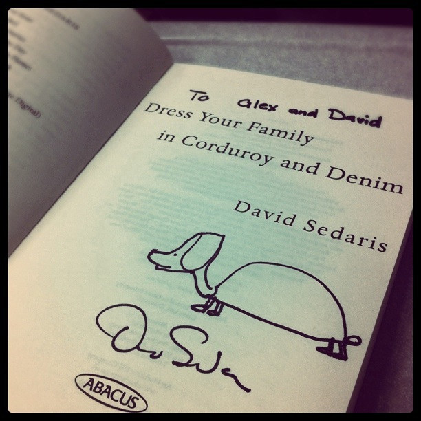 We're on the train back from Edinburgh. Alex is sitting across from me. She's reading. Our carriage is about half-full with festival goers. Teenagers swear too much on public transport. Alex had bought me tickets to see David Sedaris for my birthday. He was great. Like a lot of people, I discovered his work through This American Life and instantly fell in love. I was super happy to get the chance to see him in person. He read from his books, articles and diary. Man is he funny. The thing I enjoyed most about the talk, though, was his voice. What a voice! An unbelievably sweet and charming kinda Winnie The Pooh thing that doesn't even seem real. I'd kill for a voice like that. When I talk, it's the worst. A horrible slow drone that I've been self-conscious about since high school. David Sedaris gave me voice-envy. When he curses, you can't help but smile. After the reading, we waited around to get a book signed and to say hello. We were pretty shy, but he chatted away regardless. He asked us about Stirling and drew us a picture of a dog coming out of a turtle shell. We also ate some Mexican food and drank some Coca-Cola.
Team Recoat
I am very happy to announce my participation in a new project here in Glasgow. Recoat, the fantastic gallery in the West End have assembled a 10-strong team of artists and they only bloomin' went and asked me to join. Pretty swish, eh? I'm completely delighted and honoured to be involved because, honestly, the other 9 dudes and dudettes are way good. Waaaay good.
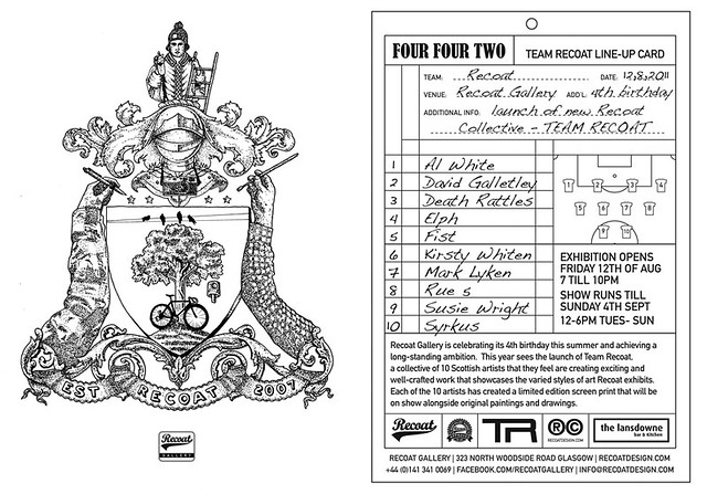
Team Recoat, as we are known, consists of: Al White, David Galletly, Death Rattles, Elph, Fist, Kirsty Whiten, Mark Lyken, RueFive, Susie Wright & Syrkus. I will try to get a post about everyone up here over the next few weeks. We will be working together on a variety of projects throughout the world over the next year.
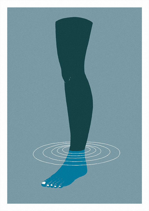
To simultaneously launch the project and to celebrate their 4th birthday, Recoat have put on an exhibition of limited screenprints designed by each of the team members. Four Four Two opened on Friday the 12th of August and will run until the 4th of September. There are 10 prints going for £80 a pop including this effort, 'Submerge', by myself:
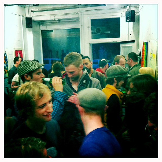
The opening party was brilliant as always - the buffet at the Lansdowne afterwards was a particular highlight. Damn those onion rings were good. Damn, damn, damn. Big thanks to Amy and Ali for all their hard work in putting on the show, thinking up the project and for running one of the countries finest galleries. Love those guys.
Stop by the space to have a look or, if you can't visit in person, all of the gear is available in their online shop. The show also features an extra wee section full of other prints, drawings, paintings and things by the team - good if you're hyped on Scottish street art and want to pick up an original piece.
If that wasn't all, the Team Recoat prints will also be making their way down to Nottingham as part of the Nottingham Festival on Friday the 19nd August at the Lace Market Gallery. There will be live painting and talks and things too (I think). My details are a bit sketchy but go have a look if you can, especially when people are around. Seeing Elph paint live is something special. Me? I can't make it. Ach.
The details once more:
- FOUR FOUR TWO
- Recoat Gallery
- 323 North Woodside Road
- Glasgow, G20 6ND
- Runs: 12/08/11 - 04/09/11
- TEAM RECOAT
- Lace Market Gallery
- 25 Stoney Street
- The Lace Market
- Nottingham, NG1 1LP
- Runs: 19/08/11 - 03/09/11
As this is a new blog, my readership is pretty low so any tweets, mentions, shout-outs, links, likes and reblogs will be very much appreciated as they will go a long way in promoting the work. Thank you and have a nice day x
Jonnie Common Album Launch

I'm extremely happy to announce the launch of Master of None, the new album by one of my favourite musicians Jonnie Common. Not only am I hyped about the music, but I'm also chuffed because Jonnie asked me to provide some artwork for the cover.
It's been a nice little collaboration, with me sending through a couple of drawings (my Dog drawing & a new pattern) for Jonnie to go crazy over with pink neon. The end result has a really awesome feel to it that neither of us could have created without the other's input. And isn't that, my friends, the point?
Master of none goes on general release on Monday the 1st of August through Red Deer Club and Glasgow folks can see Jonnie play a special album launch gig tomorrow (Sunday 31st) at the Captain's Rest in the West End. I'm gonna stop by to catch the show & to doodle up a little chalk sign for the venue, which is a first for me. Stop by if you can, he's one of the best dudes to see live.
I'm really proud to have been involved with this project. I think I've been into Jonnie's stuff for pushing 10 years now (which is scary) after I picked up one of his Down The Tiny Steps 'Picket Fence' CDs while I was studying. Not to be too much of a sook, but I've long said amongst friends that if I had any musical ability (I don't), I'd want my stuff to sound like Jonnie Common’s. He has an incredibly playful, sweet and funny way with lyrics and a seemingly bottomless bag of unusual instruments, sounds and squelches. Check out the very lovely Photosynth:
I would have preferred to have got this post up here a little sooner, but damn, my life has been busy recently. Nothing bad or serious, but my artwork has had a little break and I'm only now getting back into it and getting my head around what I want to do next.
My future output may or may not involve this blog, but there will be more to see and to read soon.
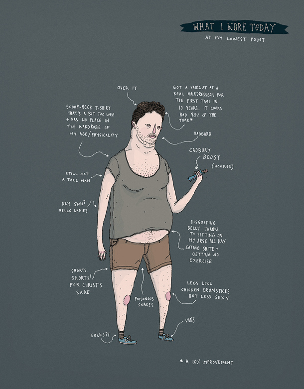
What I Wore Today 1
Recently I've put on a little weight, got myself all unfit and lost my enthusiasm for drawing due to doubting my abilities. I'm at a low, you could say.
This doubt is further exasperated by the fact that, after my unplanned break from drawing, I'm rusty. Drawing rusty is frustrating. It makes you hate drawing. A classic vicious catch-22.
So, after recieving a new sketchbook for my birthday, I've decided to give it another go. To draw just for the sake of it. To forget the mistakes and concentrate on the process. I have tried this before, and failed, so I dunno if it will work. I hope it will.
This drawing is for the brilliant Flickr group, What I Wore Today (in drawings) started by the fantastic illustrator, Gemma Correll. I have done better, I have done worse.
Frozen Synapse
Yesterday I split a 2-for-1 offer on Frozen Synapse with my friend Steven. Above is one of our first games (which I won - check that one dude doing all the work). A really positive review in Edge made me want to check it out. After seeing I could get 2 copies for £18.99, I picked it up.
The game is pretty interesting. I have a few issues (Mac mouse input isn't great, tutorials could be better, controls and timelines should be much easier to understand), but on the whole, it's a superb little brain-twister. You play in turns, simultaneously planning out your moves and predicting what your opponent might do next. What happens if my friend moves his sniper there? Oh, I get shot. Better try something else. That kinda thing. The amount of bluff-calling and second-guessing makes it play more like poker or Warhammer or chess than a top-down shooter.
Chess is a fitting comparison when you consider how you play Frozen Synapse, too. Because it's a game of turns, you don't need your opponent to be in-game or, hell, even online to play. You simple mark out your next move, confirm your actions and move on to something else. The game will then notify or email you once the opposite side has completed their part. It's brilliant, the best feature by far. It allows you to play a surprisingly complex little game as casually as you'd check Twitter or play sudoku on your lunchbreak.
If I were a reviewing man, I'd give this 4/5
UPDATE: Frozen Synapse is now available for iOS. There are great versions for the iPhone and the iPad.
John Gruber - Apple's GUI Design
I've recently become a massive fan of John Gruber, author of the Apple-focused technology blog Daring Fireball, through the 5by5 podcasting network (he's on The Talk Show). He has a wonderfully thorough, insightful and level-headed take on, well, most everything. This presentation he gave at the Webstock 2011 conference in New Zealand offers a fascinating overview how Apple has consistently innovated with their graphical user interfaces (GUIs) over the past 27 or so years.
The devil is in the details.
Stanley Kubrick's Boxes
Last night, just by chance, I noticed that someone had uploaded Stanley Kubrick's Boxes, a documentary by Jon Ronson, to Vimeo. I was super excited as I'd been trying to find it for quite a while with no luck.
The film, as far as I can tell, was made alongside this 2004 Guardian article by Ronson which I remember reading on my lunch break back when I worked in Argos. It's a fascinating exploration of Kubrick's giant (bloody GIANT) personal archive that shines a little light on his creative process.
I'd recommend giving it a look, especially because there's a chance it'll be pulled from Vimeo if the wrong kind of dude stumbles over it. It's as funny and interesting as you'd expect from a Jon Ronson documentary.
There's a suggestion in there that Kubrick understood that he could create works of genius, but only if he methodically researched every detail of a project for years beforehand. That's comforting, eh? The idea is lovely - that even if you're not a natural talent, you can achieve something beyond your capabilities if you're patient and put in enough goddamn work. It completely humanises the big, scary, impenetrable director.
I'll maybe do a wee post about my love for Jon Ronson sometime soon. If you don't know his work, his latest book, The Psychopath Test, is a great place to start.
EDIT: understand there's a good number of people visiting after a bunch of activity on Twitter last night. First off, hello! Second off, Javaring on Vimeo is deserving of credit for the upload.
iA Writin'
I just downloaded iA Writer for my iMac. It's a completely stripped-down writing app that has only a handful of settings (fullscreen / spelling / word-count) as well as a unique 'focus mode' which, when enabled, emphasises your current sentence. The idea is that you can focus on your ideas and your words without distraction. It's quite beautiful.
At £7.99 on the Mac App Store, it's also quite pricey (comparatively). Simple word processing systems are very trendy these days, which is good, I suppose, if they get folk thinking... but bad if all they do is encourage further procrastination by creating an unquenchable urge to find the 'perfect' writing app. I guess I'll need to wait until I've written a bunch of stuff (or not) to know whether I've been duped into paying a premium for what's effectively TextEdit.
If I do write more because of iA Writer, even just a little, then I consider it money well spent. A good idea is well worth £10.99.
Secret Store: Death Compass T-Shirt
 Here's a thing. The very new and very awesome Secret Store have a super limited-edition t-shirt out with my Death Compass drawing on it. Finally, something to cover your nakedness! Available in sizes for small, medium and large people, the t-shirts are hand printed on organic cotton in a run of 100. Imagine how excited you'd be were you to bump into someone wearing the same shirt. You'd point and be like 'hey!' and the other person would point and be like 'hey!' right back at you.
Alongside my design, there are shirts by Mesh137, Gareth Roberts, Keaton Henson and Isobel Kho. There is also a nifty Secret Store design to show your love / look cool / cover aforementioned naked body. Head on over to their website, take a gander and perhaps pick something up. Secret Store are also looking for up-and-coming talent to design their next range, so get in touch with them if you've got an idea.
I will send a little set of badges free of charge to anyone pictured wearing my shirt because I'd be st-st-stoked to see it out there in the world. Aaaannd if I bump into you on the street wearing one (looking at you Glasgow), I'll give you a print or a wee drawing or something.
Big thanks to Chris for his help. Get well soon dude.
Explorin'
 With spring a-sproinging all over the place, I took off on my bike on Thursday for the first time in about 4 or 5 months. My intention was to have a little explore of Glasgow's Southside - something I've not really done (outside of Shawlands anyway) since moving here last September. The winter has a knack for keeping a man inside with the telly.
A little bit of searching before I left led me to discover that two (two! can you imagine my delight?) skateparks seemed to live within a 20 minute cycle of my wee hoose and my intention was to discover, if not exactly conquer, both of them along my way.
First up, Queens Park skatepark, pictured above. I was somewhat familiar with this place from magazines and videos, but had never visited and had long forgotten it's name. Dark, rough and sketchy, Queens Park is a real Council mismanagement of obstacles too big, too small or too weird for your regular average-to-crap skateboarder like myself. Actually, even for Dudes Who Are Good, I imagine most of this park is all but unskatable (5' run-up to stairs, anyone?).
The vert ramp is Queens Park's only draw and, well, it looks ready to eat your soul. Show it no weakness. The thing is big - bigger than my photos make out - and scary - scarier than my photos make out. Some people can skate this monster (and skate it well), but not me. I take a look, wave a little white flag and scoot away on my poncey wee bike. I suspect the next time I visit will be to identify a body. My hopes turned to Rouken Glen (above) - somewhere I'd seen on YouTube, but only recently realised was on the Southside. A 2.5 mile cycle from my house in Shawlands makes this park just about viable as a 'bit cloudy but I'll risk it' option and, I dunno, it could be worse (it could be Queens Park). It was empty when I arrived but as far as I know, there's a wee local scene, which is all good. No sign of any discarded syringes - also good.
Rouken Glen is a small prefab metal park in a nice area. Not exactly inspiring but potentially pretty fun. A mini ramp would've been a nice touch here, or even some lower ledges (the main one is just the wrong side of comfortable, for short-arses like myself). The box looks not bad (bank to ledge!) and there's a bigger hip than you'd expect in a place like this. A decent dick-about spot, I reckon. Good for getting rid of the rusty knees before summer.
If, by a long shot, anyone knows other good places to skate on the Southside of Glasgow, particularly near Shawlands, let me know. I got so used to living 5 mins from a park in Stirling that I find it weird not being able just to nip out for half an hour anymore. Oh and sorry about the cheesy Hipstamatic photos - I got a new phone recently and I can't stop playing with it.
Oh, and along similar lines, my friend Ben has started a blog called Terminal Moraine about skateboarding in Australia, his new home. Give him a wee follow. He's a smart cookie and, if he properly gets into the blogging habit, it'll be a good 'un. His exploring partly inspired this post.
Kid Canaveral: You Only Went Out To Get Drunk Last Night
Happy Valentine's Day! Here's a thing that may, or may not, be appropriate. A while ago, I was asked by the fantastic Kid Canaveral if I would like to make a music video for their song 'You Only Went Out To Get Drunk Last Night'. Of course I did! After a few delays, setbacks and general slowness (on my part), I finally asked for a deadline and got to work. The above video is the result. For a better viewing experience, click here to watch it on YouTube properly (clicking up the resolution / video size goes a long way).
For me, video and animation is a funny thing - I don't really know what I'm doing. The ins-and-outs of cameras, shutter speeds, lighting, exposure etc. are all still kinda outside my understanding. I'm learning though. The KC video may not exactly be beautiful, but I think it has a certain charm to it. I hope? Maybe? I read a very encouraging interview (here) with Michel Gondry before I began filming where he said:
"I care less and less about the aesthetic quality. It finds its way into it anyway. I can't bother with that and the less attention I pay to it the better it becomes."
That was exactly what I needed to hear. The perfectionist part of my brain got booted well and truly out the window and I concentrated more on just having fun and throwing as many ideas into the silly thing as tI could. All the mistakes - the wonky shadows, visible wires, shakes and wee glimpses of hands were suddenly Good Things, not Bad Things. I tried to keep in mind stuff like Adam & Joe, Oliver Postgate and the Teeny Little Super Guy from Sesame Street rather than, I dunno, Chris Cunningham or Shynola.
Speaking of fun, I can honestly say that this was one of the funnest projects I've ever worked on. It was a blast. Along with my wonderful fiancée Alex and my best friend Fergi, we hunkered in over four long nights and pretty much mucked around. Alex in particular was incredible throughout - she worked her socks off, took damn near every photo (8000 odd) and came up with loads of the best ideas. I couldn't have done it without her, no way. She's amazing. Fergi did some brilliant stuff in the crazy-kitchen scenes too. Check the cups in the cupboard at 2:43 - I didn't even spot him doing it. Haha!
As for Kid Canaveral, I was super chuffed to work with them again (I did a poster before). Kate has been completely lovely at putting up with my rubbish and giving me freedom to go nuts with their song. So if you like 'Only Went Out..', I'd really recommend you pick up their album 'Shouting At Wildlife', it's a cracking wee record that's full of energy and life. I'll try to get round to a proper post about the band soon because this one is going on a bit and I'm worried people will just tune out. One thing I will say is that they're off to SXSW next month and they've been organising a few gigs to support their jaunt - check out their website for more details (they're playing Glasgow, Edinburgh and... New York!). If you can, pick up some tickets or pick up an album - you wont regret it.
Anyway, enough from me. Please have a look at the video - if you enjoy it, clicking on the 'like' button on YouTube goes a long way in helping it reach more people. If you really like it, any tweets, posts, blogs or links pointing people towards it would make me a very happy man. I'm quite proud of it. Hopefully soon I'll be able to do some more video stuff (Jonnie Common & Johnny Lynch, I'm looking at you). Stay tuned here or on my Twitter for further stuffage.
