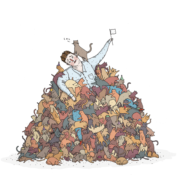
This spot illustration appeared in the April 2012 issue of WIRED accompanying a piece about memes by Mary K. Choi. While browsing through my old files, I found a few roughs from the project and figured the process was interesting enough to post about.
I don't draw in my sketchbook as often as I should. Over the last couple of years it has mostly worked as a scratchpad that sits on my desk while working on the computer or loose paper. WIRED briefs always had a fairly short turnaround too, so sketchbook work was particularly minimal. Here it looks like I've written a couple of lists while reading the rough draft, sketched out some cats (probably while drawing the final artwork) and called it a day.
That's not to say I don't plan and develop ideas, it's just that my thinking tends to live in text files and doodles on my phone or computer. This isn't as romantic as carrying around a collection of beautiful or fascinating things, but it works for me. I don't like people to see my ugly and embarrassing sketchbook. It's not one for Pinterest.
After I've bashed together 4 or 5 ideas in my head, I'll usually grab a pen and a pile of thin white card and start scribbling down thumbnails. I use the card because it's dead easy to scan and colour.
10 minutes per rough with little or no pencil work is plenty. If a particular idea starts to come together nicely, I'll maybe take a second or third attempt. If it doesn't do much for me (like the exploding Mentos + Cola drawing above), I'll quickly throw some colour on it anyway on the chance that it'll spark the art director's imagination*.
I try to send over a variety of different ideas. I'm not precious about any of them and stress that they can be used as starting points for different approaches. Maybe they can be tweaked, added-to or combined to get something better. Maybe they need to be thrown out entirely. That's ok.
I like how this guy turned out. I want to punch him.
Cats? Hmm.
A big pile of memes? Maybe, but it's unclear what the hell they're supposed to be, even if I added a bunch more and tidied everything up in the final artwork. How about combining this idea with the cats-in-a-trashcan above...
Now we're cooking.
I was fairly confident that this was the best idea when I sent everything over to WIRED. They agreed. My feedback was to stress that the character was swamped with memes (in this case Lolcats) and had given up hope.
In the final drawing I moved the character down inside the pile and gave him a wee 'surrender' flag. After colouring, the art director asked me to add a little 'LOL' up top to hammer the message home.
The process behind the Memes illustration is fairly typical for me. Some are easier - going straight from scribble to final artwork, some are harder - endless roughs, final artwork scrapped by an editor at the last minute. Still better than having a proper job, though.
* Beware! This is a dumb idea. I do this because I'm not smart and want to look like I've done a whole bunch of work. Clients will often pick a rough you hate and you'll have a miserable time with the final drawing.


